

A strong visual identity helps a brand stand out, communicate effectively, and build trust with its audience. Here are 10 great visual identity rules to follow:
1. Consistency is Key
Use the same colors, typography, and design elements across all brand materials to create a cohesive look.

2. Simplicity Wins
A clean and minimalist design is more memorable and versatile than a complex one.
3. Use a Distinctive Color Palette
Choose a few primary and secondary colors that align with your brand’s personality and evoke the right emotions.

4. Typography Matters
Select one or two complementary fonts that enhance readability and reflect your brand’s tone.

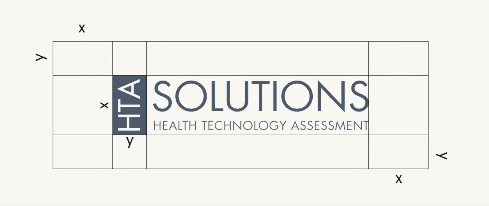
5. Logo Versatility
Ensure your logo works in different sizes, colors, and formats (monochrome, horizontal, vertical) to maintain visibility in all contexts.

6. Consistent Use of Imagery
Define a style for photography, illustrations, and icons that align with your brand’s mood and values.
7. Whitespace is Your Friend
Allow elements to breathe by using ample spacing to improve clarity and readability.
8. Scalability and Adaptability
Your design should be effective across various mediums, from business cards to billboards and digital platforms.

9. Create a Strong Brand Voice
Visuals should complement the brand’s voice and tone to communicate a unified message.

10. Document Everything in Brand Guidelines
A detailed brand guide helps ensure everyone (internal teams and external partners) follows the same visual identity standards.

By following these rules, your brand can achieve a professional, recognizable, and lasting visual identity. 🚀